
In Praise of the Thai Palette
I am no artist, but I travel in the company of an artist and am therefore qualified to speak on all manner of things esthetic, including the Thai eye for color.
The idea that there is a Thai color palette—one composed primarily of pastels, and one with flexible organization that is psychological rather than physical—occurred to me in Museum of Contemporary Art Bangkok, while looking at two paintings by Chaleomchai Kositpipat.
The sky caught my attention, painted with subtle bands of color that didn’t fit my intuition and certainly not my understanding of white light’s spectrum. You can have a look at digital versions of the paintings Heaven Vehicle to Buddhist Land and Heavenly Vehicle to Heaven. The affect is more obvious on the full-scale canvases, which are quite large.
I may not be a visual artist, but I am a scientist, and once alerted to a theory, start looking for empirical evidence to support or conflict with the theory.
I could easily look to other works in the Thai Neo-Traditional Art exhibition. For example, there are the racier works of Sompob Budtarad, like Chao Praya Goddess 2.
To me, there is a gentleness and flow to these color schemes. To me, they seem to speak to the Third Noble Truth of Buddhism: suffering can cease.
Crazy? Perhaps the connection to Buddhism is crazy, but once I started looking, I was seeing pastels coloring many surfaces of Thai life.
Pastels were in evidence every time I ate. Here is a photocomposition of some serving dishes and plates to consider.
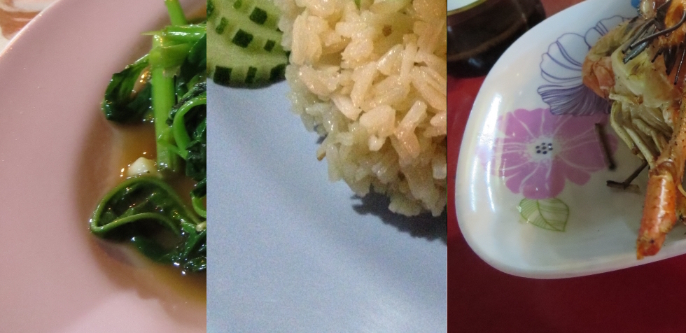
Three typical plates of Thailand. What motivates a cook to choose a color? We are uncertain about motivation, but sure of the color trend. Click the photo to enlarge.
“But wait,” you say. “Maybe it’s just easier to mold plastic with pastel colors.”
Maybe. But consider how many baby toys you’ve seen which are plastic and colored with strong blue, yellow, red, and green.
In Hat Yai, the pastel signal was so strong, I was compelled to write this piece.
Just a few minutes out of the train station I saw this stretch of buildings.

Older commercial buildings along Nipatuthit 2 in Hat Yai. These are not the only examples of the their kind. Indeed, even some much more modern buildings in Hat Yai had spectrum-like spreads of pastel. Click the picture to enlarge.
I was in a Hat Yai department store, looking for a completely different item when I saw this display of ballpoint pens.
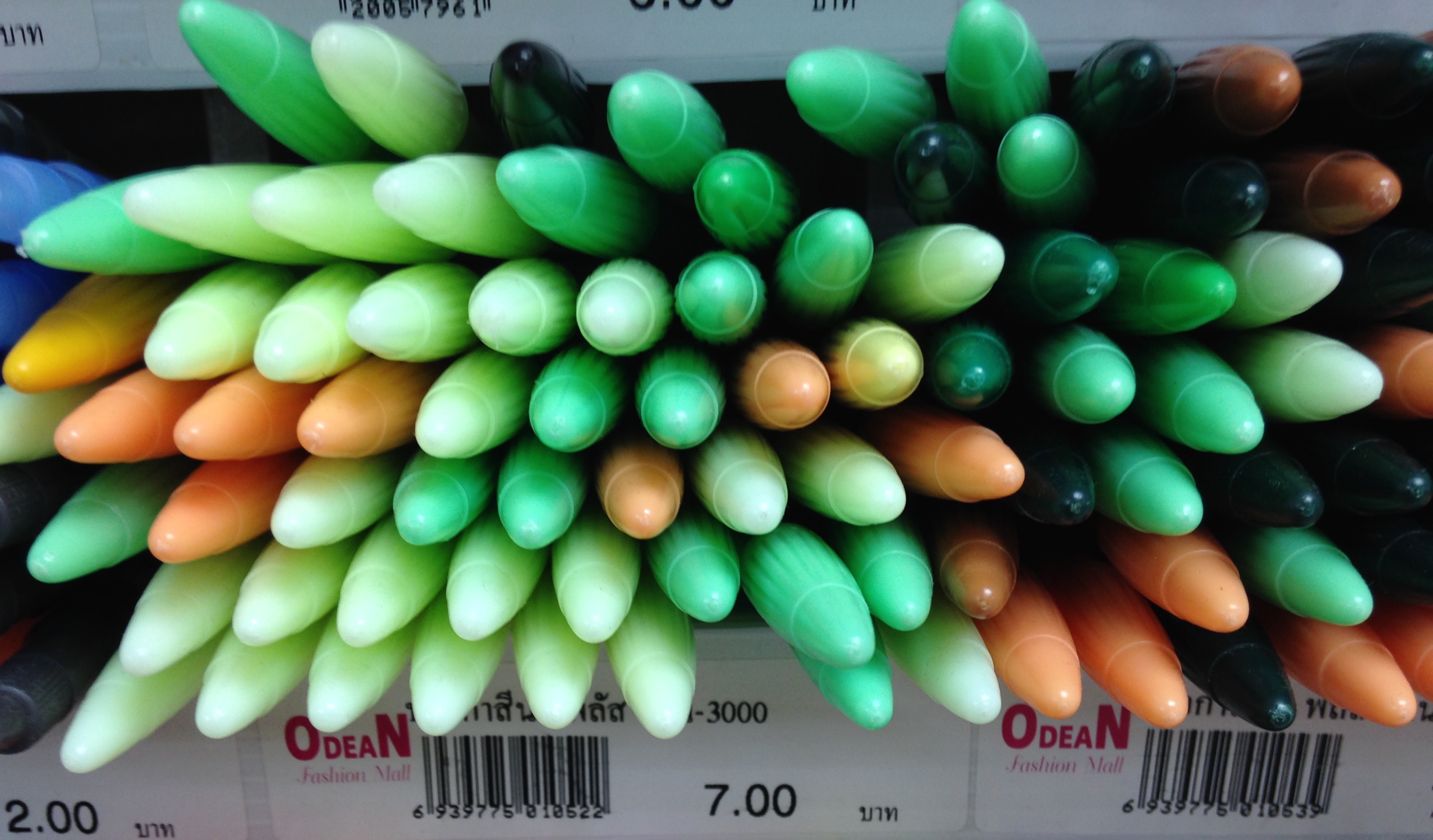
A bin of pens in the office supply section. Do Thais like to write in green and pale orange ink? I think not. I think they like to be surrounded in pretty pastels. Click the photo to enlarge.
I didn’t test them, but I don’t think their ink was the color of these caps. I think the people in office supplies department know that Thais like these soft tones. They stock and artfully display pens with pleasing colors to fill the need.
I come to you in praise of this soft-hued esthetic. Regardless of whether these colors have any connection to Buddhism, they are very easy on the eye. Easy on the brain.
Once can walk about in Thailand with far less visual strain than in, for example, India, where a bright, saturated fuchsia might be right next to a bright, saturated yellow which might cram up against a bright, saturated blue.
I come to you in praise of the Thai palette because it is merciful.
A witness to visual suffering and its cessation,
Chris
Recent Comments